- Yahoo may be back on top: Comscore names Yahoo #1 in U.S. unique visitors, and that’s without counting Tumblr’s 133 million blogs. A little early for Marissa Mayer to proclaim, “How do you like me now?” — but I sure hope she’s thinking it.
- Have you checked out Whisper? This mobile app for sharing secrets is getting 2.5 billion page views a month. Some terrific UX work and an interesting network structure where users aren’t featured — each post rests on its own merits.
- Some good data on teens, mobile apps, and privacy from Pew and the Berkman Center. Teens may be getting savvier about their online footprint: those who seek advice about managing privacy online are more likely to disable the location feature.
- What’s your 14-year-old doing on the internet? In September, she could be networking on LinkedIn as it opens its doors to teens and enables University pages.
- From teens to seniors: Y Combinator demo day showcased a number of promising startups, but I agree with TechCrunch that TrueLink is a big idea. It’s a credit card that enables families to help their seniors stay financially independent but avoid scams — huge market opportunity there.
Category: General
-

Friday 5 — 08.23.2013
-

How to Build a High-Performing Digital Team
Organizational development is hard — and new digital capabilities require some new mindsets and skillsets. Posted over at Harvard Business Review blog network: six attributes to consider when sourcing talent for a high-performing digital team.
-

How to irk an employee via enterprise email
 A friend of mine recently switched jobs to join a large company. He completed all the typical first-day HR orientation activities, and after lunch received his new email address. The address took the first seven letters of his last name, Kraftman, and dutifully appended the first letter of his first name, A — to create an email address: “kraftmaa@company.com”.
Needless to say, he was frustrated. Most humans will read that email address as a typo, even if they know his full name. But despite numerous calls, IT wouldn’t budge — he’s stuck with it for the foreseeable future. Which made me think about the role of rigid enterprise email conventions in a digital free-for-all world.
Since the 1990s when enterprise email first came into widespread use, IT organizations began to standardize conventions for the local parts, the name section that appears before the @ symbol and the closing domain part. Webmasters and other early adopters may have sneaked in their own clever short names and the CEO likely got to choose, but your average employee received a standard formula like:
- first_last@company.com
- first.last@company.com
- firstinitiallast@company.com
The idea behind the convention was clearly to create a predictable system: easy for IT to implement and easy for external people to infer. But as the consumerization of IT took hold, by 2009 people’s work email became for many the least sophisticated thing they did on the internet instead of the most. IT constraints start to chafe when you are arriving in the workplace with a fully-formed online identity, and your email address conflicts with the ways you are already known.
Here’s an example. Let’s say your passport reads Mary Evans Schafler, but from birth you’ve gone by Molly. So you’ve snagged facebook.com/mollyschafler, @mollyschafler on Twitter, mollyschafler on Instagram, and linkedin.com/in/mollyschafler — and then you arrive in your new job. Suddenly, you’re mary_schafler@company.com. This new handle is not so easy for others to infer — and just think of all the Michaels who are Mikes, the Jameses who are Jims, and the Eduardos who are Eddies. Even if your enterprise-issue email address doesn’t look like a typo like unfortunate kraftmaa@company.com, you can end up with an identity that’s not a fit.
What’s the answer? IT doesn’t want the complexity of managing multiple conventions, and there’s something to be said for the neatness of one-size-fits-all data. And you could argue most people type an email address only once, after which the magic of Gmail or Outlook kicks in and the address becomes a contact. But as more millennials enter the enterprise, employees may feel strongly about having an email identity that jibes with their already ubiquitous online self. Think of it like having your name on your business cards — not a lot of companies will insist that a Christopher use his full name instead of Chris.
With mobile technology, enterprise employees voted with their feet. Employees brought in handhelds and tablets to thwart firewalls and perform work-related transactions until programs like bring-your-own-device (BYOD) emerged. I wonder if email will be the same: eager to retain employee communication, companies may flex to allow employees to choose their own username — just as they do everywhere else on the web.
Photo credit: AJC1
-
Friday 5 — 08.16.2013
- User generated content as hypnotic and addictive: watch and listen to Wikipedia being edited. According to the creators’ blog, the sounds indicate addition to (bells) or subtraction from (strings) a Wikipedia articles, and the pitch changes according to the size of the edit.
- Facebook is not quite over yet — Pew finds that 94% of teens have Facebook accounts, and 81% report it’s the profile they use most often. Facebook’s deep integration via API and login mean that this traditionally fickle demographic may find it hard to detach from the mothership (even if their mothers are on it).
- Millennial news outlet Policy Mic gets kudos for its viral success, driven by smart adoption of behavioral analytics. Policy Mic understands that serious content can still be shareable, and the difference between optimizing for social and search.
- The role of social channels as a significant content distribution vehicle was underscored when a site outage compelled the New York Times to publish breaking news on Cairo via Facebook. If your organization is still treating “traditional” digital and social as different beasts, now’s a good time to rethink your approach.
- Ready for the weekend yet? I’ve previously covered the banana slicer, but Amazon has compiled a most excellent list of its funniest product reviews.
-

What is an annotation on the web?
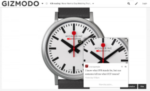
A new content type, user annotation, has been cropping up on popular websites lately. An annotation allows site visitors to interact directly with a chunk of content rather than scroll to the bottom of a page to leave a comment. User-contributed annotations are not only a way for readers to interact with text, but for users to engage with other media like images on Gawker and audio files on Soundcloud.
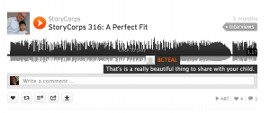
Unlike threaded commenting, which descends all-too-frequently into a cage fight of the uninformed versus the enraged, annotations offer the hope that civil discourse can occur when users interact directly with the content. User contributions are marked by a small icon (in this case, a 1) that other site visitors can click on to expand:
How do you create an annotation? Here’s what the process of leaving an annotation looks like on Quartz:
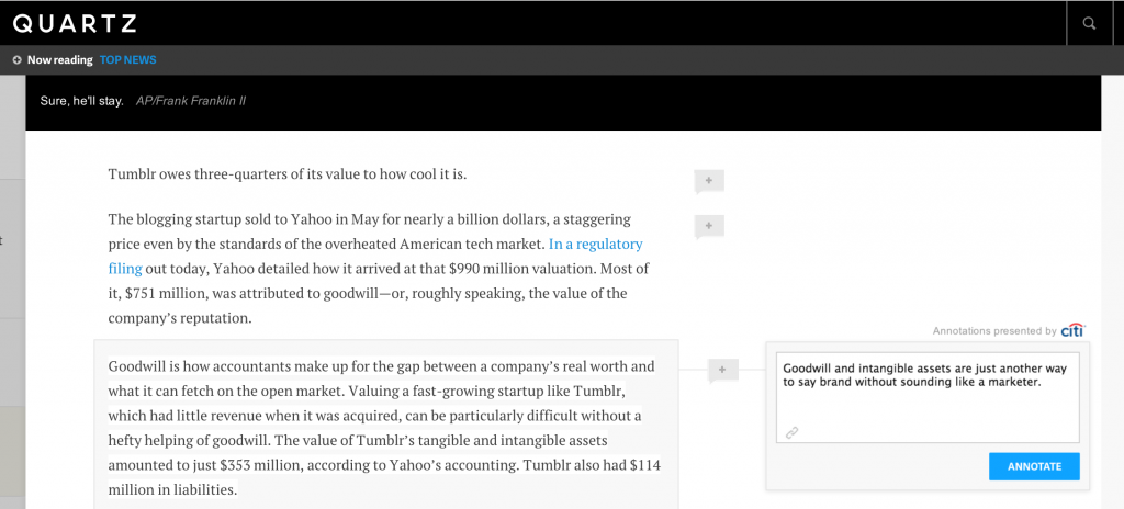
Clicking on the + box brings up a simple text field to submit an annotation. Site authors and editors can moderate the content before it is posted, and reward thoughtful contributions by featuring or replying to the annotation.
See the Citi logo at top right of the text field? That’s a clever revenue approach to have corporate sponsors underwrite a specific technical feature. Sponsoring technical features offers a promising complement to a predominantly native advertising business model used by many news sites — with fewer of the underlying editorial concerns.
Annotations have been around forever in academia, but this relatively new web behavior will be familiar to a wider group of people who use comments in ubiquitous desktop applications like Word or PowerPoint.
The days of sitting back and passively viewing content are, for good or for ill, over. Finding ways for people to interact with content that encourage new ideas or productive debate is the new nut to crack.
-

5 ways to make your admin interface shine
Your design meeting for the new website was standing room only. People who routinely wear mismatched socks showed up to express strong opinions on color hue, saturation, and value, and to weigh in on flat vs. skeuomorphic design. A public website for the enterprise is important — it’s a brand statement seen millions of times each month. So while it’s not surprising that these meetings garner internal attention, it’s unfortunate how little mindshare is paid to its less sexy alter ego, the admin interface.

Chicago Tribune taken over by kittens – was the admin interface to blame? The admin interface is the dashboard view for the internal users managing your site through a content management system (CMS). A fair amount of your website may be automated through feeds or ad servers, but odds are you still have a team to edit/add content or choose what to feature on the homepage. Spending the time to make this dashboard a user-friendly control center instead of a jargon-filled, out-of-the box system can improve productivity and reduce errors.
- Start by giving your developers a clear idea of how site admins will manage site content. Who writes/curates the content? What’s the process for inputting the content, and for any proofing and approval? How often does existing content get updated, and how much new content comes in each day? How many site admins need different levels of access? The bottom line is that the technology must support human users, and not the other way around. An out-of-the-box system can adequately handle 90% of the use cases. But considering the amount of time your site managers spend each day inside the admin interface, small improvements can add up to big value.
- Volume matters. Make sure to test each aspect of the interface with the right amount of content. For each entry, make sure heads, subheads, and copy lengths approximate or are real ones. (For fun: read a good attack and defense of Lorem ipsum) Once you’ve populated the system with hundreds or even thousands of content items, is it still possible to quickly find a specific article or multimedia asset for an edit?
- Disable unnecessary features. Most CMS systems serve general audiences, and offer features and links you may never use. Developers are often loath to remove features because they may someday be useful. It’s important to push for showing only what is needed. Removing unnecessary options will make daily functions easier to find, and accelerate task completion.
- Enable workflow, but also workarounds. Enforce data validation, but be careful not to create processes so cumbersome that they slow down content entry. The workflow needs to be painless enough to ensure its adoption, and anticipate common use cases. But recognize that you can’t design for every content and staffing scenario, so leave some flexibility in the system. Examples might include a “nuke” button for a social media feed, or a way to override approvals for certain content types.
- Add your brand to the admin interface. This interface is the home screen of the people who work in it. As much as is practical, make sure your organizational and site identities are reflected. The latter is particularly useful in seeing at a glance one site’s admin interface from another in organizations where admins may manage multiple sites.
Internal, task-oriented admin interfaces will never be the rockstars that public website designs are, but an infrequently updated site can often be tied directly to how damn hard it is to add or change content. Investing time in thinking through and designing a usable admin interface does more than make your internal users happy — it’s a strong predictor of a well-maintained public website.
-

Email: definitely not dead yet
 In 2011, email was not long for this world according to virtually all the tech headline writers out there. Three recent events are reminders that there’s still a lot of opportunity inherent to highly-measurable, easily-adjustable content delivered to you anywhere on your mobile device.
Earlier this summer, Wired reminded us not to dismiss email given all the data-driven insight it provided to the Obama campaign:
Some Tech staffers had dismissed email as old-fashioned and uncool, without understanding how indispensable it would be in saving the campaign.
Last week, the New York Times realized that boomers are still heavy email users (and valuable consumers for their advertisers):
We’re pleased to announce that starting on Tuesday, Aug. 6, Booming will publish a weekly e-mail newsletter. This means you won’t have to go looking for us — we’ll find you.
And it’s not just the old media stalwarts. Quartz announced this weekend that it’s expanding its daily brief to include a weekend edition.
When we tried out a weekend version of the Daily Brief a while back, the response was enthusiastic. So from today we’ll be in your inbox each Saturday morning too, with some thoughts on the week’s big themes and the best writing we’ve seen on Quartz and around the web. Please give us your feedback, as always, by replying to this email. We hope you enjoy it.
Photo credit: greggoconnell
-

The science of website design
Few would dispute that website design is a creative exercise. A recent study by Katharina Reinecke and colleagues [PDF] would imply that there’s some interesting, quantifiable science baked in as well. Both common sense and studies confirm that users judge a site’s appeal within seconds. Reinecke et al. offer some compelling findings on how visual complexity and colorfulness play into that initial judgement.
The researchers found visual complexity to be a significant factor in initial appeal. Low-to-medium complexity in the visual design translated into more positive initial impression. Apparently, preference for low visual complexity is notable for viewers over the age of 45. (Anecdotally, I’ve observed this as a similar cutoff age for tolerance of an endless scroll.)
 The study also analyzed reactions to colorfulness, measured in part by distribution of colors in an image and composition of adjacent colors (the complementary colors effect). Overall, colorfulness was found to be a less important driver of visual appeal at first impression.
The researchers also captured and analyzed demographic data. Findings included that while age correlated with preference for low-medium visual complexity, education level interacted more significantly with colorfulness. Gender did not play a major role in either visual complexity or colorfulness, and the study indicated that further research is required to better understand the role of native language and aesthetic rating.
The process of creating website design remains highly creative and subjective. Great design, to a degree, follows Justice Stewart’s dictum: “I know it when I see it.” But the more we can understand and quantify the specific elements that form an initial and lasting impression, the better user experience we can create.
Photo credit: Victor Hertz